StumbleUpon, one of the few social media websites, is known for generating huge traffic for blogs across the internet. On 6th of December, StumbleUpon got its new look and finally it completes its make over which was rumored since it closed the profile theme feature in October, 2011. StumbleUpon with these changes trying to present more responsive and attractive interface for its users. All new look has now been converted into light Gray color and presentation of text and images become bigger which look nice to the eyes at first sight. New logo also adds some attraction to the current theme; logo color is now Red with combination of White. Okay, let’s discuss the new features of StumbleUpon one by one –
Interface
All new look, StumbleUpon convert its home page showing all the selected topic of interest of logged in user. Now there are big thumbnails of all the selected categories. A new good looking Red & White logo, minimal menu having only three items – Home, Profile and Discover, all these features are giving new StumbleUpon a good appealing look.
Toolbar
Forget about the Firefox add-on, now new StumbleUpon has its new full-functional toolbar of Dark Gray color. This toolbar has all the features of Firefox SU add-on plus now you can view all of your received shares sent by your friends. At the right corner of Toolbar, settings Icon and its functionality recall you the Gmail, because it has the same user avatar, and other option like Gmail. If you click on the story of your received shares the old message toolbar will appear with two new options – one view and reply and second next button, which will lead to the next story of your received shares.
Now thumb up or like button and thumb down or dislike button have more options to consider any story on internet. The story will be hidden if you expand the like and dislike menu option. Share story option gets more responsive with new tabbed look, now it’s easier to share any story from toolbar. Now to add your review you don’t need to go to the SU website, just click on the comment bubble icon on toolbar and you will be presented a comment form showing previous comments and an option for adding yours with tags.
This new SU Toolbar is faster than the previous version, have more user friendly features and response rate too is higher than the older one.
Profile
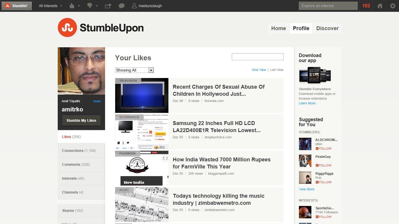
Profile page of StumbleUpon somewhat adopts the Facebook look. User picture and profile options are available at the left portion of the profile page. There is a more link under user picture which leads to a light-box having detail information of that user. Followers, following and visitors are now grouped together into Connection option. Now you can see all your followers and visitors at one place. A new history option is added to the left menu which lists all the pages history you have watched.
Mid portion of profile page shows the story you have liked, your follower, following and visitor list, which is available in two view option – list view and grid view. Right portion shows suggestions in Stumbler to follow, channel and category. From here you can download SU application for smartphone too. Overall this profile page is better and gives you newer experience.
Discover
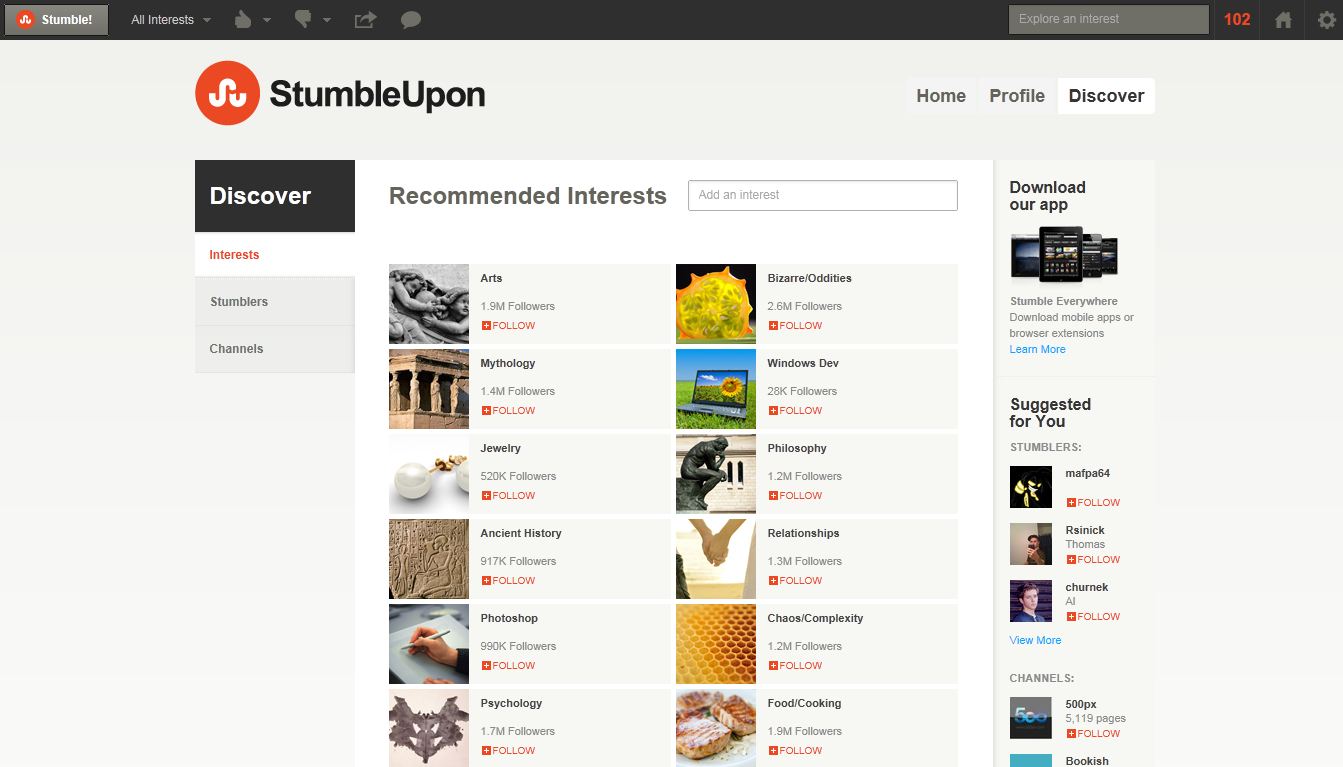
This page gives you three options – interest, channel and Stumbler, from here you can grow your network by adding more suitable Stumblers to your profile and like more interesting pages easily because it lists only those pages which match with your interests. Nothing more changes to this page, experience is too same as the previous SU.
Discovery
New Discovery layout with old options is available at here. Nothing new in this option, just use the previous way of discovering your interest.
Settings
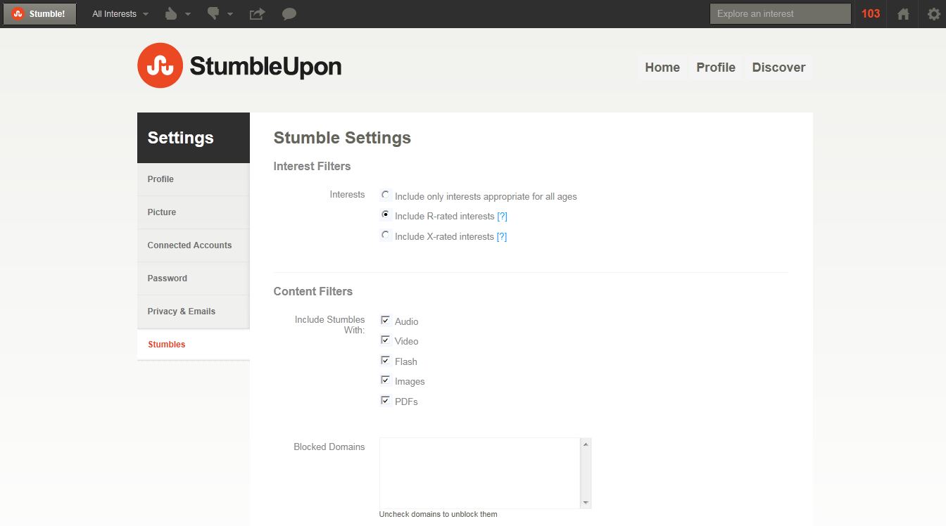
Again new interface with little bit changes, now likes and interest page is gone. Just add your details and about you text, no extra information like books, music, games, movies etc. StumbleUpon tries it keeping simple and easy to use, no lengthier profile page.
The future
With these changes, StumbleUpon is trying to fill the gap between the speed and look. New StumbleUpon is faster and more responsive than the older one. Improved SU Toolbar is USP of this new interface. This version seems to be more user friendly and compatible to visitors because somewhat, its interface matches with Facebook. But the actual result depends on mass response, time will let us see whether SU users love this interface or not. For now, we have discussed what’s new in StumbleUpon and what’s it promising with users. Following image gallery shows some view of new StumbleUpon –
I am Samith Jhon a content writer and a Professional Blogger. I am certified with JN0-570 Test which is very popular these days and have a great scope in the field of IT Certification. I always like to take JN0-532 Test to pass the Tests. These kinds of Test questions could secure your future as well as your job.


