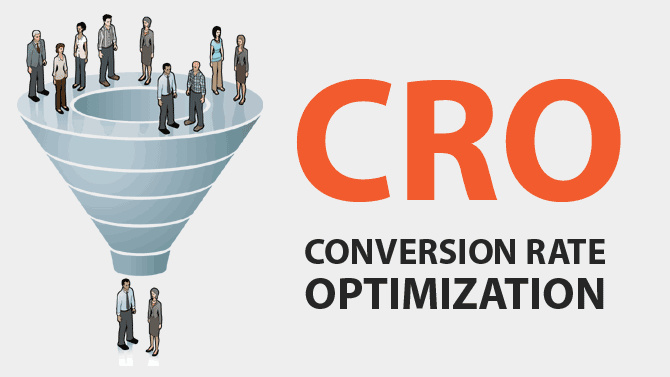
Having a large number of online visitors to your site with low or no sales on a daily basis can be one disappointing thing. However, this should not make you feel like you aren’t offering the best for your visitors. You might provide great products or services, but perhaps your website could have some flaws which are making it tough to convert online visitors into sales. Conversion rate optimisation experts, Converted say there are always ways in which you can boost your website conversion rates. Our top conversion rate optimisation tips include:
HAVE A COUNTDOWN OR TIMER FOR OFFERS
Have you seen the countdown most shopping platforms put up when they are giving away seasonal offers? (If not, a good example of this is the Halloween offer from by The Amazing Chocolate Workshop). You notice that most people tend to buy a lot of stuff during this period just before the deadline hits. Most businesses report having mega sales on such deadlines. The timers put a sense of urgency to the customers, which encourages them to buy your product now, rather than think ‘I’ll come back later’. The chances are, they might buy your product even if they had doubts about it or had the procrastination ideology. Timers allow for an increase in sales and can help boost the conversion rate of a site over a given time period.
LOCATION TAGGING
As simple as it might sounds, this tip has helped improve sales for lots of websites. Location tagging is when your websites incorporate things like Geo-tagging when a user clicks the page from anywhere in the world. The feature automatic personalises the landing pages to the specific location that the shopper is clicking from. This personalisation makes the shopper feel much incorporated and encouraged to purchase a product from your website.
CALL TO ACTION BUTTON THAT STANDS OUT
We have to agree that most online shopping sites have a call to action button. But what makes your call to action button to be clicked a lot by your visitors. To begin with, have a call to action button that is conspicuously displayed, which is bold and stands out. You can have other call to action buttons throughout your site, but there must be one which is bold so that users have a clear understanding of where to purchase/interact.
OPTIMISE YOUR WEBSITE’S CHECK OUT PROCESSES
This is a critical area since most customers pick most of your products, but when they are at the checking out process, they realise your website doesn’t support their payment means. If the checkout stage of a site doesn’t live up to the user’s expectations, then they may decide not to go ahead with the purchase; furthermore, they might decide not ever to visit your site again. Instead, ensure your website check out process are effective. Being effective means that your site supports all means of payment means from PayPal, Master Cards, Visa, American Express among many other modes of payments. Variations of payment method allow for different customers to engage in your services without trouble, thus increasing your conversation rate. Here is a list of the 12 e-Commerce Sites with the Most Inspirational Checkouts.
HAVE A SIMPLE LANDING PAGE
We are in an era where people aren’t attracted to bright colours and a beautiful design, especially while online; they’ve seen it all before. For many people, browsing online is all about simplicity and ease. A simple colour scheme and easy to understand/navigate layout is a great start when you’re looking at converting visits into sales and leads. A simple landing page includes all the vital information needed or of value to the customers, i.e. the products you offer, the call to action button and the customer reviews. The latter fills confidence in the customer’s heart and goes a long way to convince users that your products or services are trustworthy – social proof. Simplicity and trust help to boost conversion rate.


