Responsive web design is latest trend in web design community; every designer is trying to achieve this layout for their design projects. In responsive web design layout, websites are designed in such a way that should response to any device it is being opened on. So there should not be different layout for mobile device and desktop devices. The magic behind responsive web design layout is fluid grid, which reset resolution of a website according to the device size and resolution it supports. Today, we’re featuring 20 tutorials on Responsive Web Design for web designers. These will aid you to learn how to design fluid grid website layout easily.
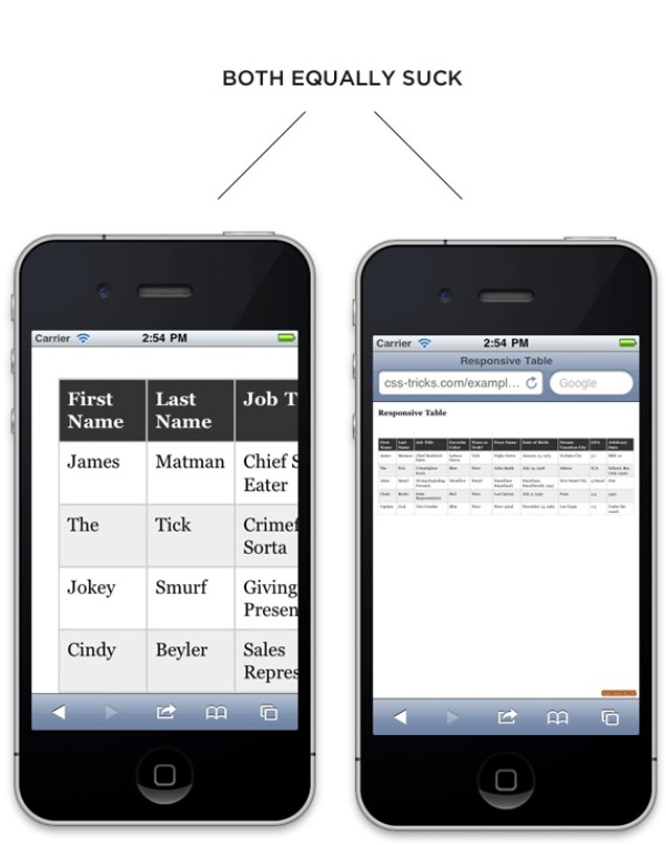
Responsive Data Tables
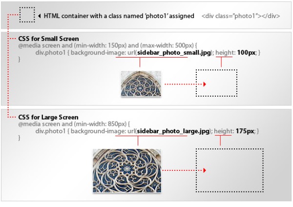
Responsive Design with CSS3 Media Queries

CSS: Elastic Videos

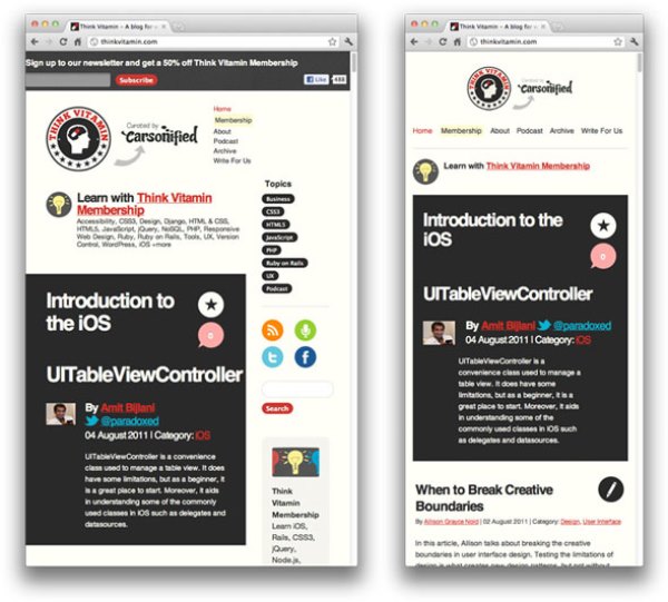
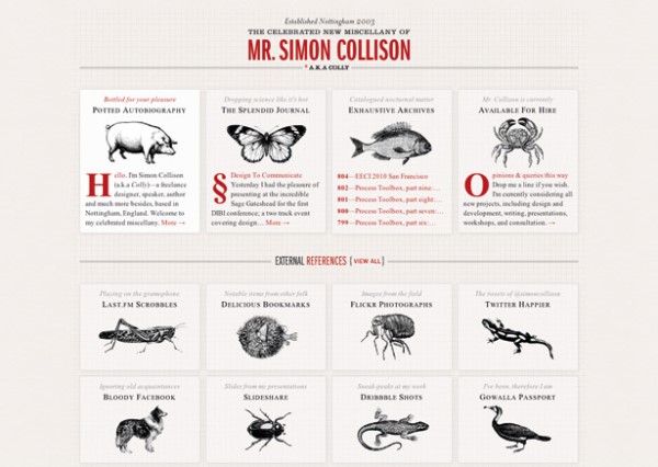
Techniques in Responsive Web Design
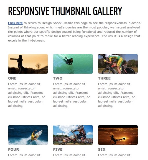
Responsive Thumbnail Gallery
Adaptive layouts with media queries
Fluid CSS3 Slideshow with Parallax Effect
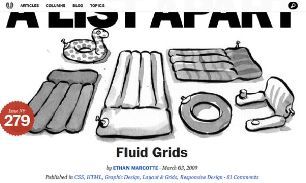
Fluid Grids
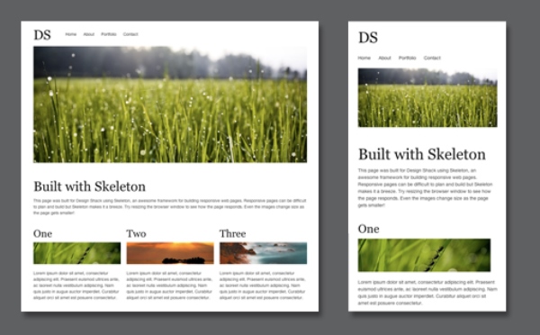
Build a Responsive, Mobile-Friendly Web Page With Skeleton
Designing for a Responsive Web
Flexible Slide-to-top Accordion

Techniques For Gracefully Degrading Media Queries

Responsive Horizontal Layout
How to Turn Any Site Into a Responsive Site

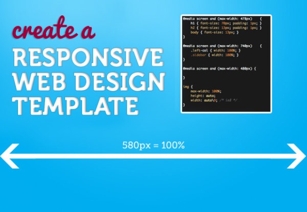
Create a Responsive Web Design Template
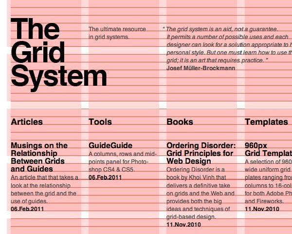
What It Is and How To Use It

Responsive Content Navigator with CSS3

Coding a Responsive Resume in HTML5/CSS3

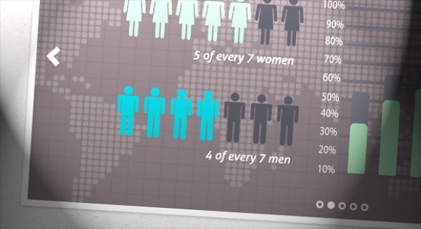
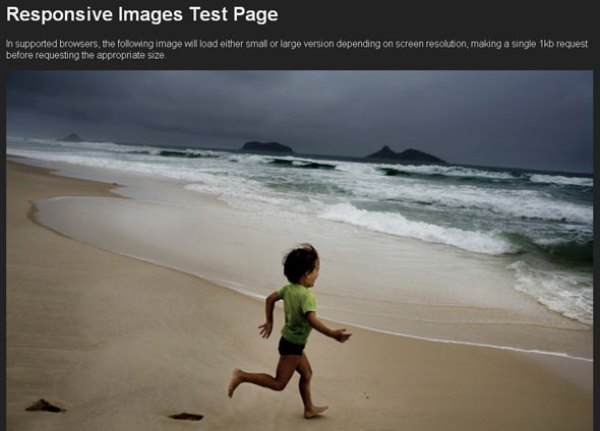
Experimenting with Context-aware Image Sizing
Beginner’s Guide to Responsive Web Design