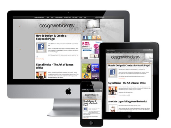
With users browsing the Internet from their smartphones and tablets than desktops, you’re missing out on sales and traffic if your website doesn’t perform on those devices. Fortunately, there are a number of plugins you can employ to make your WordPress-powered website friendly to mobile users if you’re not familiar with coding or if you don’t want to change your current desktop layout. WPtouch, WordPress Mobile Pack and MobilePress require minimal effort and automatically detect mobile browsers. You can also apply the content of responsive design yourself if you prefer.
Responsive Design
The heart of mobile Web design is responsive design. Every object on your page should, ideally, display in percentages, which allows images, DIVs and tables to shrink no matter the size of your visitor’s screen. CSS media screens allow you to style elements differently based on screen size, so keeping your grids flexible and fluid by using percentages is the key to your website working on every screen.
However, it’s not the only consideration. Large images, JavaScript and other technology might work just fine on a desktop browser, but visitors to your WordPress-powered blog might be sorely disappointed if your website’s basic functions break because you use those technologies. You’ll also want to reduce whitespace on smaller screens so that viewers can more easily see content.
WPtouch
This plugin includes three themes that you can choose from for your mobile site. You can then customize colors. Options include a simple home page for your site, or you can use custom HTML instead. Add your custom header and links to the dropdown menu to ensure that your website provides all the content that you want in mobile view. The mobile theme even includes image and content sliders. Nothing about WPtouch is generic. The plugin automatically updates in your WordPress dashboard.
MobilePress
With MobilePress, you can offer intensive or lighter themes, so your website always performs with grace. You can even specify specific themes depending upon the browser that your mobile visitors use. If you’re a developer, you can use MobilePress to develop your own mobile themes for WordPress.
One of the native features of MobilePress allows you to continue displaying ads on your mobile website. Most plugins or mobile-friendly themes strip out ads and other extras that exist in your WordPress theme, so this is a handy feature.
WordPress Mobile Pack
The final plugin in this list supports multiple themes, each which turns your blog into one that works great on mobile devices. WordPress Mobile Pack goes as far as to create a mobile-friendly dashboard, so you also get to reap the benefits of installing this plugin. A simplified version of the dashboard makes it easy to add new posts, while your visitors will have no trouble touching or clicking around your index, individual post pages and archives. Each type of page is known as a widget with this plugin.
WordPress Mobile Pack includes options to remove media such as images or Flash, break up large pages and shrink images. Thus, you can retain some of the elements, such as a Flash logo, for mobile browsers that support this technology. It’s all up to you.
Whether you code your website so that is gracefully responsive or save a little time and effort by installing a WordPress plugin, your website and business will flourish because of it.