Angelina Jones loves the web, when she is in office, she is always connected with the web using her desktop computer; updating her inconsistent moods with her Facebook friends. When she is in her car, on the way to her home, she is always connected with her friends with her smart phone, updating her tweets every minute. When she is travelling, then she uses her iPad and constantly updates her location using Foursquare. Observed the pattern? Besides being an internet freak, which is always online, she uses a variety of gadgets to be able to use the web. And this is the core behind responsive WordPress themes. In very brief, a responsive theme is a WordPress framework for your blog which can auto-adjust it based on the device which is being used to access it.
Hence, when Angelina wishes to surf your blog from a desktop computer, the responsive WordPress theme shall automatically understand that the device is a desktop, and thus present itself according to the pixel available on a standard monitor.
When Angelina uses her smart phone to access your blog, the responsive WordPress framework shall auto detect the device, and thus present your blog according to the standard pixel size available for a smart phone. And the same case with an iPad or Kindle or any gadget which is currently being used.
In short, it is blessing in disguise for bloggers and webmasters who have not thought about this radical change in the end user behaviour. With advent in technology and lesser time for the readers, web access is virtually happening on the move. It can be a traffic jam or a late night party or inside the aircraft or on the beach – users are accessing your blog and your website from everywhere.
In such scenario, it becomes imperative for the blogger or the webmaster to choose such a theme which can auto-detect the device and present the blog accordingly. A responsive WordPress theme does precisely the same thing.
How does it work?
A responsive WordPress theme is created using CSS 3 with fluid proportions based grids. The term fluid proportions based grid is named after the ultra flexible nature of this updated CSS version. Based on the screen properties of the specific device, the layout of the theme is automatically altered to fit into the screen just like fluid such as water can take the shape of the container where it is stored!
How can you be benefited?
Being a blogger, it becomes very tough to comprehend and execute different layout themes for different devices. Prior to the introduction of responsive themes, bloggers used to deploy mobile themes and some random plugins which used to convert the existing theme into a particular mobile based layout. However, such arrangement proved failure, as everyday a newer version of smart phones and tablets are being introduced in the market. You just cannot design a theme based on a particular tablet or a particular smart phone. By using an elegant and ultra-cool responsive WordPress theme, all you need to do is install such a theme, and experiment it based on the visibility on several devices.
3 Beautiful Free WordPress Themes
If you are looking for some free responsive themes, which are both creative and designed for maximum conversions, then here you go:
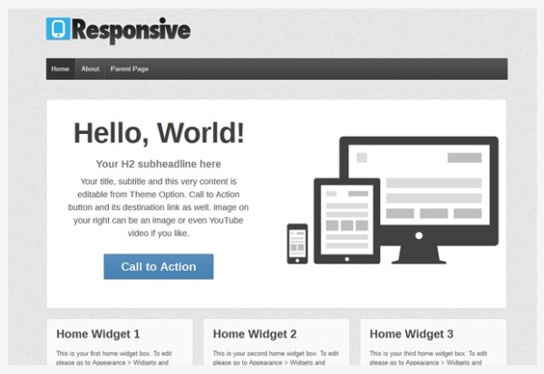
Responsive Theme
Responsive Theme features several layouts templates such as blog page, blog summary etc. Additionally, it also has full width page, sitemap template, landing pages and much more! Lots of bloggers have chosen this theme for its minimalist design specifications and so many features. It can support translation up-to 22 languages.
Download

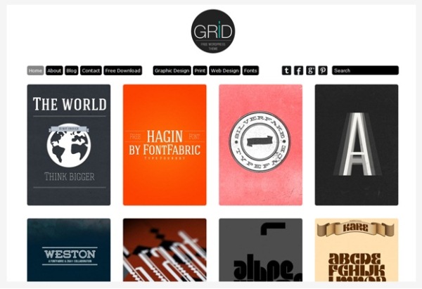
Grid Theme
Best suited for content curators and news journalists, Grid theme has lots of features which make it the best suited responsive theme for mobile and tablets. One of the best features of this theme is the unlimited scroll. Other notable features include WordPress 3.3 upgrade and Search Engine Optimized.
Download

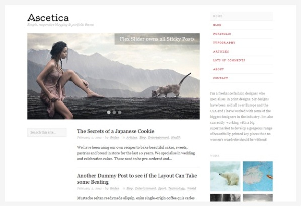
Ascetica
Ascetica is very popular among photographers and photo-journalists. Aesthetically designed with lots of spaces in between. Featuring some of the top features like custom header, custom page templates, sticky posts and several others.
Download

Author’s Bio
This post has been written by Alice who is working as Online Marketing Manager at Go4Hosting.com.You can reach her @Go4Hosting on Twitter. Go4Hosting provides world class website hosting services which include powerful data center India and result oriented dedicated servers.


