Ever since the iPhone’s debut back in 2007, Apple has been hooked on to the mobile device and its platform, iOS, to a level where most analysts and loyalists couldn’t help but think the Cupertino based company had diverted attention from its once flagship product, the iMac. It was understandable, given the iPhone and iPad’s meteoric impact. However, apple reassured fans by holding an appropriately named “Back to the Mac” press event in October last year, where among other things, it previewed Mac OS X 10.7 Lion for the first time. After several developer builds, Lion is finally out of the door. It’s a step in Mac OS X’s evolution where Apple has imported plenty of features and insights gained from its iOS business. Let’s take a closer look.
Lion’s new look and feel
With OS X 10.7, apple has given subtle facelifts to the overall interface as it was in OS X 10.6 Snow Leopard. The UI is a lot sleeker, minimalistic almost; no longer loud or over emphasized. Many blue highlights in popup windows, for example, are removed to make for a more monochromatic interface. If you see the image below, the buttons aren’t acutely curved, neither are they filled with excessive glossy blue visual cues. Even the top tabs aren’t glossy blue anymore – a regular feature associated with the older Snow Leopard’s default color scheme. The radio buttons are toned down and, overall, the interface doesn’t distract. Also the traffic lights red, yellow and green window buttons have gotten smaller in OS X Lion. The scroll bars – not visible in the finder window – make the iOS influence plain to see. We prefer this new slightly color muted look of Lion’s interface.
Apart from changing the Mac OS X Lion’s login screen, Apple reinstates iOS lessons a little more forcefully by including a touch enabled input device on every Mac it sells – whether it’s the multi-touch trackpad on the Mac Books or the Magic Mouse or Trackpad with the iMac. Touch enabled devices were introduced in the pre Lion era, but they vecome increasingly significant with Lion’s out-of-the-box support for a slew of touch enabled gestures. In fact, Lion mimics touch input similar to an iOS device like iPhone or iPad.
However, users are in for a minor shock when Lion informs them that the default scroll behavior has reversed, if you scroll your finger up on the Magic Mouse, the active window in front of you will actually scroll down, against natural perception of motion. Luckily, there’s a fix to this perceived problem – a minor disabling of a radio button in System Preferences > Mouse. In all finder windows containing scrollable content, the new Lion UI shows no scroll bars when they’re launched. But scroll on the mouse or track-pad to trigger the overlay scroll bar to appear and scurry up or down. You’ll witness a few instances of the massive influence exerted by iOS over Mac OS X.
Mission Control and Launchpad

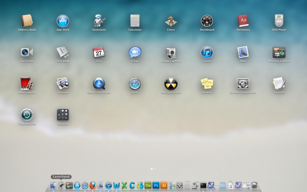
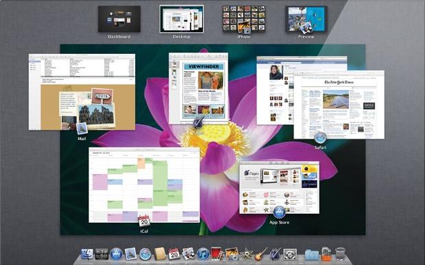
Apple has tweaked an existing feature of past Mac OSes and borrowed the essence of iOS to contribute towards Mission Control and Launchpad, respectively. Both these apps reside in the Dock next to the finder. Mission Control is a combination of Expose, Dashboard and Spaces with some fresh features all rolled into one. At the top, you see arrow of windows which essentially is the old Spaces, to add a new Space, just click on the top right corner; every full screen app is shown as a space. Below the top row you have the central, Expose like section where you see all open windows grouped by their app. In the bottom, you see the ever present Dock with a spotlight under the apps that are open and highlighted in Mission Control. Mission control is a lot of fun and is actually pretty useful. Nevertheless, this is handy new addition to OS X.
Interesting Apps and Features
While it’s impossible to cover every small feature and app within the confines of this article, we’ll list some interesting ones nonetheless. Auto Save and Resume – Apps that support Auto Save can automatically save changes to your documents as you work; think Google Docs. All changes are saved in the background and you can work without any distraction of pauses or progress bars. What’s more, Auto Save in OS X Lion adds the changes directly into the file so there’s only one copy of the document on your Mac.
AirDrop – a new but limited feature, AirDrop lets you easily share files between Macs within close physical proximity of each other; works great at an office environment or home with multiple Mac users. It requires zero setup, no configuring and is extremely simple to take advantage of. Click on AirDrop on the left sidebar of your Finder window to see radar like image with your own Mac stationed at the bottom, if someone is accessing their AirDrop window within a range of 10 meters, they pop on to your AirDrop radar. To share files just drag and drop on the Mac icon within AirDrop, that’s it. Communication is secure and peer to peer.
iCal – as you can guess, the UI is heavily influenced by the Calendar app on the iPad. Even though we like the leather clad, hand sewn, minimal look of the iCal in Lion. We don’t like the disappearance of the extremely useful left hand column which would allow quick launch and flipping through multiple calendars. The tab views at the top that is Day. Week, Month and Year are identical to the iPad Calendar app and useful. The Quick Add feature for instantly adding a calendar event is nice and helpful, too.
Mail – the new email app’s interface in Mac OS X Lion is inspired from iOS’s email app. It has a three pane layout: the left pane has all your mailbox related features like inbox, drafts etc.; emails from the account are shown in the middle pane, arranged as per date, flags etc. and the third, right most pane displays the email content and conversation thread. The new Mail in OS X Lion has the ability to preview and email under its header, just like in iOS and the iPad. We don’t mind the iOS ification of the Mail app in Lion; it actually works out pretty well.
End of an Era
With all new things, there comes an inevitable end to that which is old, whether we like it or not, with OS X Lion, Apple has officially discontinued support for Rosetta which used to allow running apps written for older Power PC on newer Inter architecture Macs. Apple has inconspicuously removed support for Front Row, Mac’s media center software, and it has disappointed fans and bewildered users, especially because the newer Lion is more than capable of handling the app.
Lion is no doubt a major step forward for Apple’s Mac OS X and only time will tell whether Apple’s philosophy of merging iOS with OS X will be a hit or miss. As things stand right now, Mac users are in a transition phase with Lion, and for $29.99 you can see what all the fuss is about.


